Brand & visual systems
Building a scalable illustration system for Uswitch
Shifting from ad-hoc, inconsistent asset creation to a structured, reusable and strategically aligned visual language across every channel.
What we did
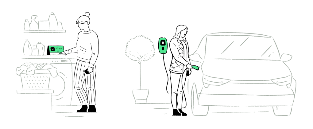
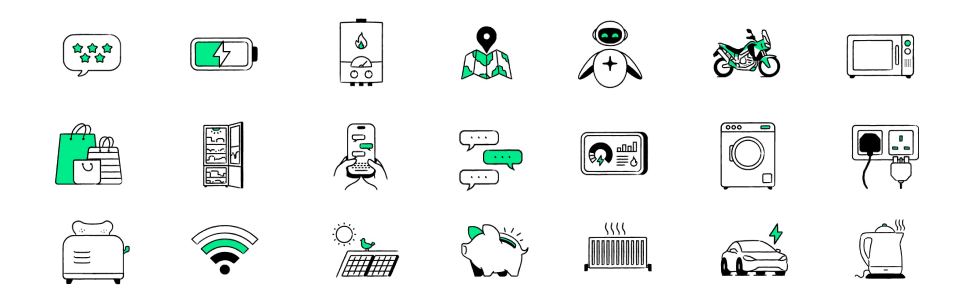
Uswitch lacked a scalable illustration system. Existing assets were limited, frequently reused, and inconsistently applied across channels, weakening brand recognition and creating inefficiencies for both marketing and product teams. We were also unable to reuse assets from ATL TV campaigns.
What initially appeared to be a need for "more illustrations" was, in reality, a broader systems problem — an opportunity to shift from ad-hoc asset creation toward a more structured, reusable, and strategically aligned visual language.
Strategy
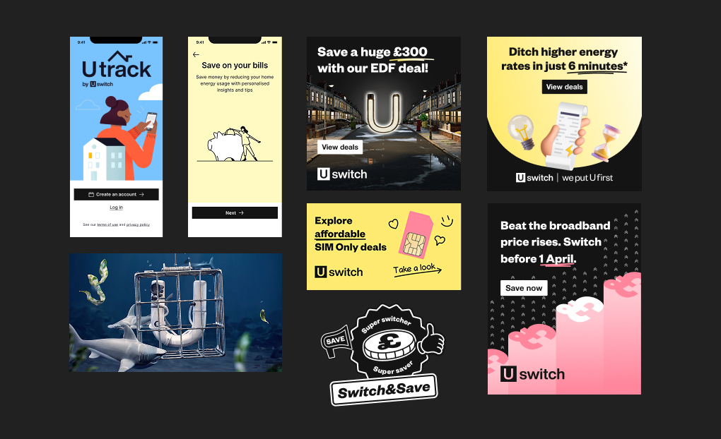
I reframed the initiative from producing illustrations to defining a flexible, system-driven approach that could scale across touchpoints and use cases — balancing a consistent, ownable style with the adaptability to work across every channel, while staying technically viable for motion and animation.
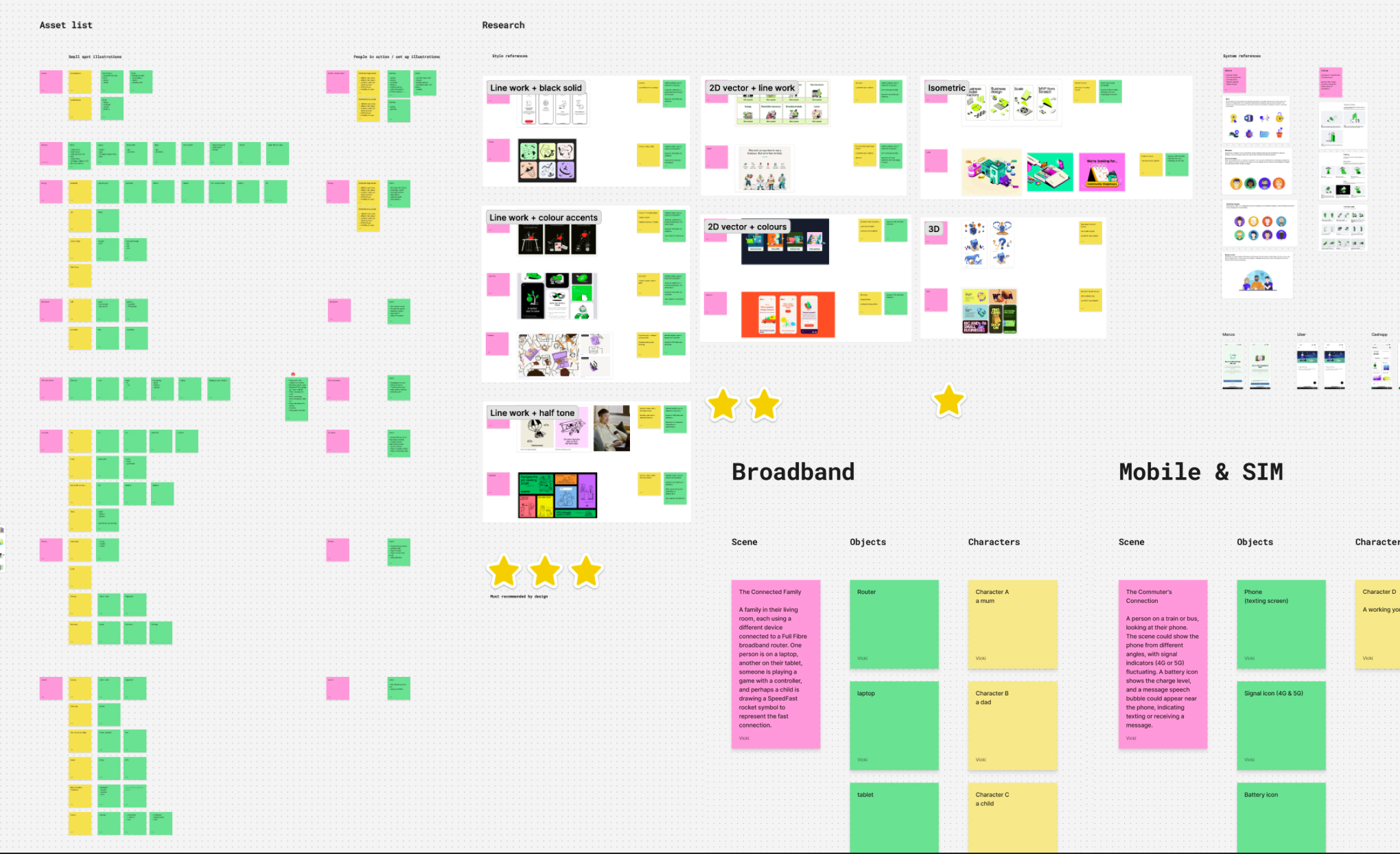
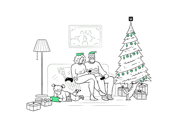
Early exploration was intentionally broad, letting the team test stylistic boundaries and build alignment around what worked, and what didn't. A key principle was introducing modularity early, so assets could recombine into new scenarios without constant redesign and cost.
Leadership approach
My focus was on creating clarity, alignment, and an environment where specialists could contribute at their highest level.
- Set creative direction and established a clear quality bar across teams
- Aligned internal designers and external illustrators around shared principles
- Introduced weekly critique and feedback loops to maintain pace and reduce rework
- Structured collaboration to leverage strengths across motion, visual design and illustration
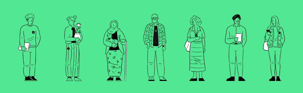
- Ensured outputs reflected diversity and inclusivity within the visual language
Key challenge
Balancing creative exploration with system constraints was a constant tension. The need for a distinctive, ownable style had to coexist with practical requirements — modularity, cross-channel use, colour constraints and motion readiness. Anchoring the work in modularity from the outset shaped both the stylistic direction and how assets were constructed for static and animated use.
Outcome
- Defined a cohesive and scalable illustration direction aligned with brand needs
- Established clear boundaries by identifying both successful and unsuitable styles
- Created the foundation for a reusable, cross-channel illustration system
- Fast-tracked collaboration efficiency between internal teams and external partners
60%
Cost reduction to creation and iteration vs. alternatives
1 system
Reusable across CRM, web, app, social and print
Strong
Stakeholder alignment and buy-in across teams
Reflection
The project generated more organisational momentum than initially anticipated, with interest extending beyond the immediate scope into other teams and brands. With hindsight, I'd secure earlier buy-in to move from exploration into full system production, and position the work sooner as a multi-brand strategic asset.
This reinforced the importance of recognising when exploratory work has broader strategic value — and acting on that momentum earlier.