Revenue growth
Driving immediate revenue growth through paid channel optimisation
Reframing a pricing and marketing problem as a customer decision-making problem — and generating 10x the original commercial target.
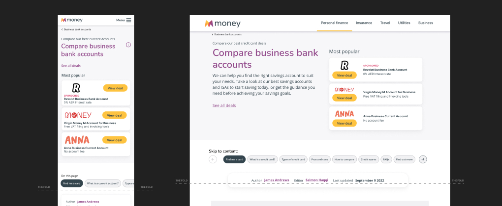
What we did
Following significant design system changes, the organisation set new commercial goals. Within Financial Services, leadership set an ambitious target for additional CPA/CTR by improving the user experience.
The strategy centred on two commercial levers — increasing the percentage of users who clicked through to a partner, and increasing the value of each click by helping users choose the account that gave the best commercial return, rather than simply the highest-ranked option.
Strategy
Rather than approaching this as a ranking problem, I reframed it as a customer decision-making problem. The design needed to be more than a comparison table — it needed to guide users toward the options most relevant to them, balancing commercial value with genuine product fit.
The strategy focused on surfacing differentiation between products in ways that felt useful rather than promotional, positioning commercial placements with future flexibility for expanded partner ranges.
Customer experience
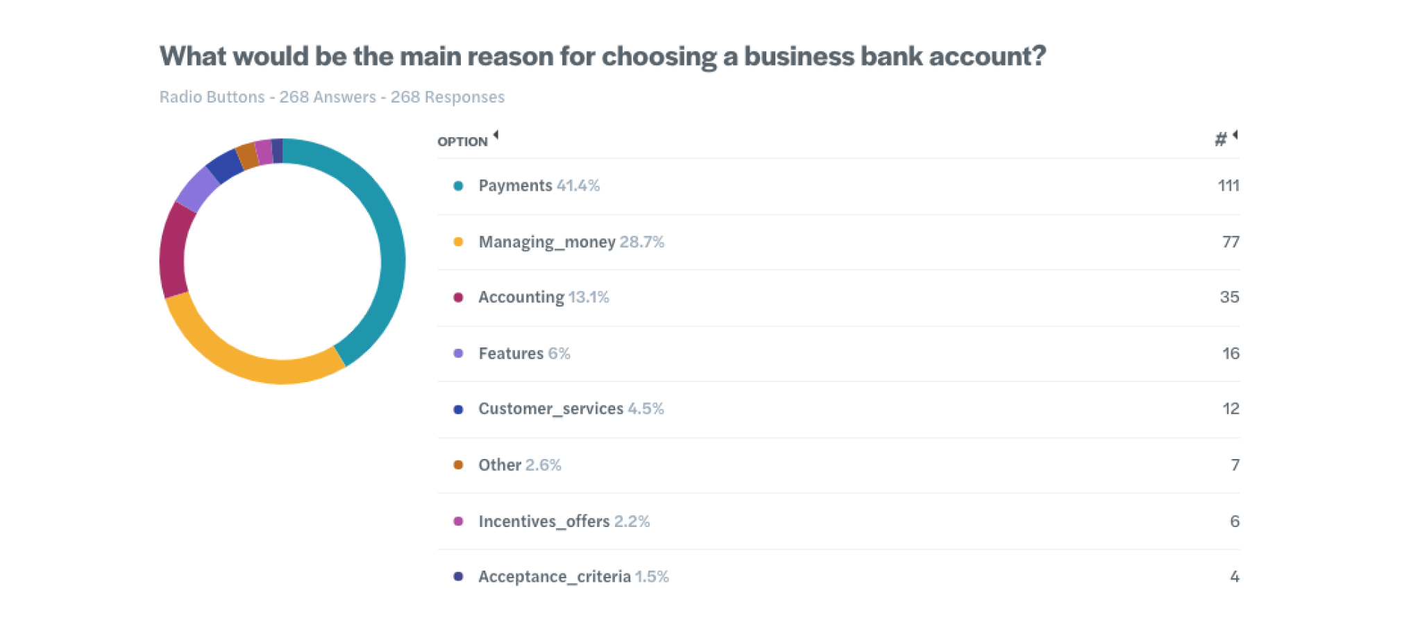
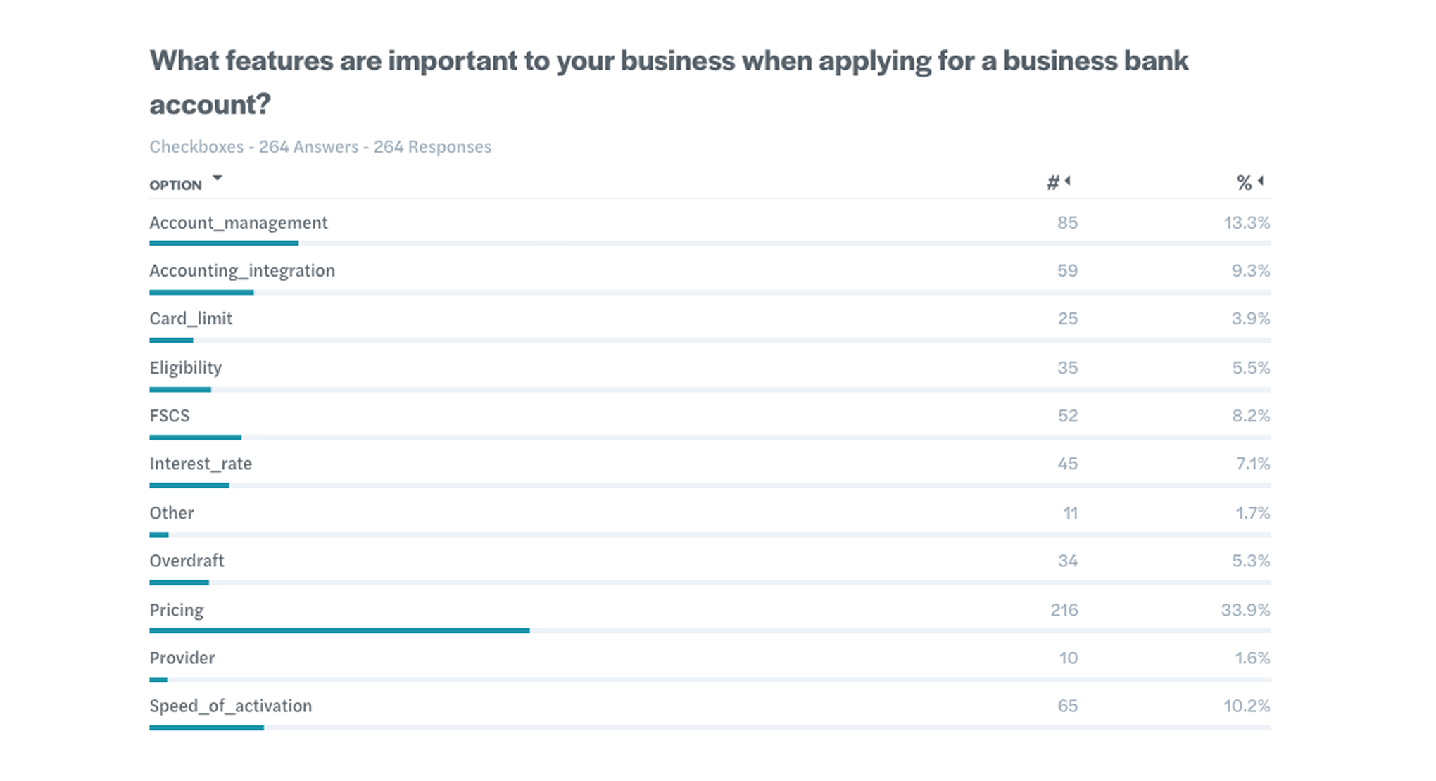
I worked closely with Commercial, Engineering and Compliance to align business needs with customer needs. Through rapid iteration and collaborative reviews, we identified the differentiators between products that were most meaningful to users, and applicable consistently across categories and brands.
- Conducted research to identify partner value differentiation
- Prioritised design changes with the fastest iteration cycles
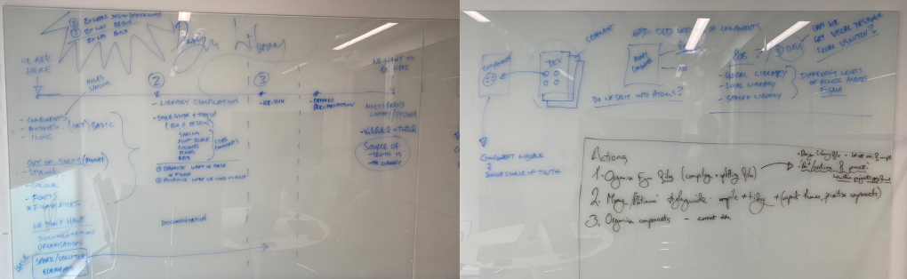
- Sketched several concepts before committing to development
- Reduced cognitive load with clearer decision-making criteria
Solution
The core need was to move beyond a static ranking table and give users context that explained why a particular provider suited them, not just where it ranked.
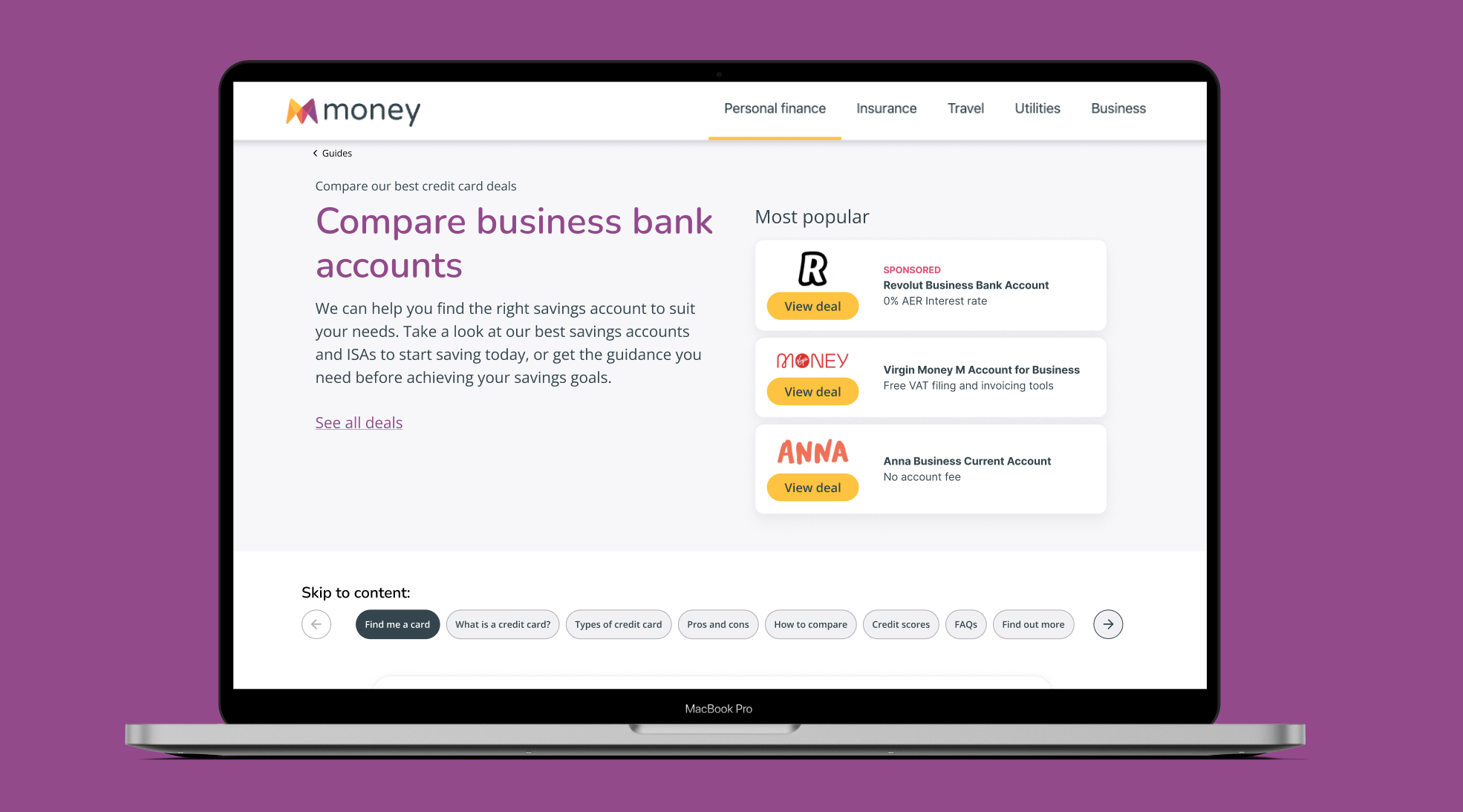
- Highlighting top-performing accounts for customer relevance
- Introducing softer badging to differentiate between leading providers
- Increasing the use of contextual cues to improve scanning
- Providing supporting content to reduce friction and increase decision-making confidence
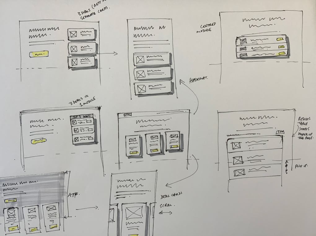
Testing & validation
We ran a rapid experimentation approach to understand each variant's impact on engagement, click-through behaviour and awareness of alternative providers — testing multiple layout hypotheses before committing to a final direction.
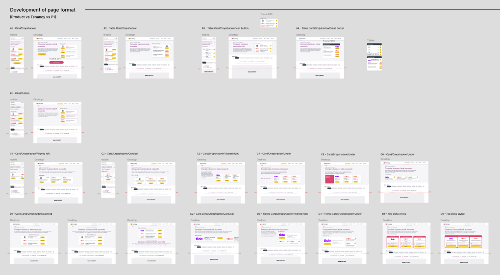
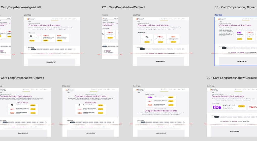
Outcome
The work established a scalable framework for future iterations, and the successful pattern was carried forward into other pricing and placement pages. By focusing on relevance, differentiation and flexibility, we drove impact well beyond the original commercial target.
£1M
Recurring monthly revenue delivered
10x
The original commercial target
Higher CTR
Across key comparison experiences
Higher RPC
Revenue per click vs. baseline pages
Reflection
This project reinforced how much value sits in reframing a problem before designing a solution — treating it as a decision-making challenge, rather than a ranking or pricing exercise, unlocked results well beyond what the original brief asked for.